Guest Bathroom Design Plans - One Room Challenge Week 1
It’s finally October, and while in Orlando that still means 90 degree temps (and plenty of pumpkin candles to trick myself into thinking it’s fall), it also means the start of the One Room Challenge! I’ve been wanting to participate in the One Room Challenge for literally years, but the timing has always been off. Last October I was about to get married, this past spring I was homeless and in the middle of a move…so Fall 2018 it is!
It’s finally October, and while in Orlando that still means 90 degree temps (and plenty of pumpkin candles to trick myself into thinking it’s fall), it also means the start of the One Room Challenge! I’ve been wanting to participate in the One Room Challenge for literally years, but the timing has always been off. Last October I was about to get married, this past spring I was homeless and in the middle of a move…so Fall 2018 it is!
Not sure what the hell I’m talking about? Here’s some info from the One Room Challenge website:
The One Room Challenge™, currently in its fourteenth season, is a widely anticipated biannual event every April and October. Each round, twenty design influencers are selected to take the challenge and transform a space. Every Wednesday, the designers document their process while sharing their sources and professional advice over the six weekly posts.
In addition to following along, everyone with a blog, is welcome to join the fun as a Guest Participant by linking their own room transformations up during the six weeks. Each Thursday, the internet and social media are flooded with interior design inspiration, ideas, and encouragement.
We have a lot of work to do in our new house, but the one room that’s currently top priority to get finished is our guest bathroom. A little backstory on our house - it was built in 1976, and nothing had been touched since then. It was full of shag carpet (even in the bathrooms, minus this one), low ceilings covered in glitter popcorn, and overall just felt dark and dingy. We closed on it in July of this year, and just moved in during the second week of September. We’re still living in more or less a construction zone, and don’t have a kitchen, but it’s coming along!
The Before
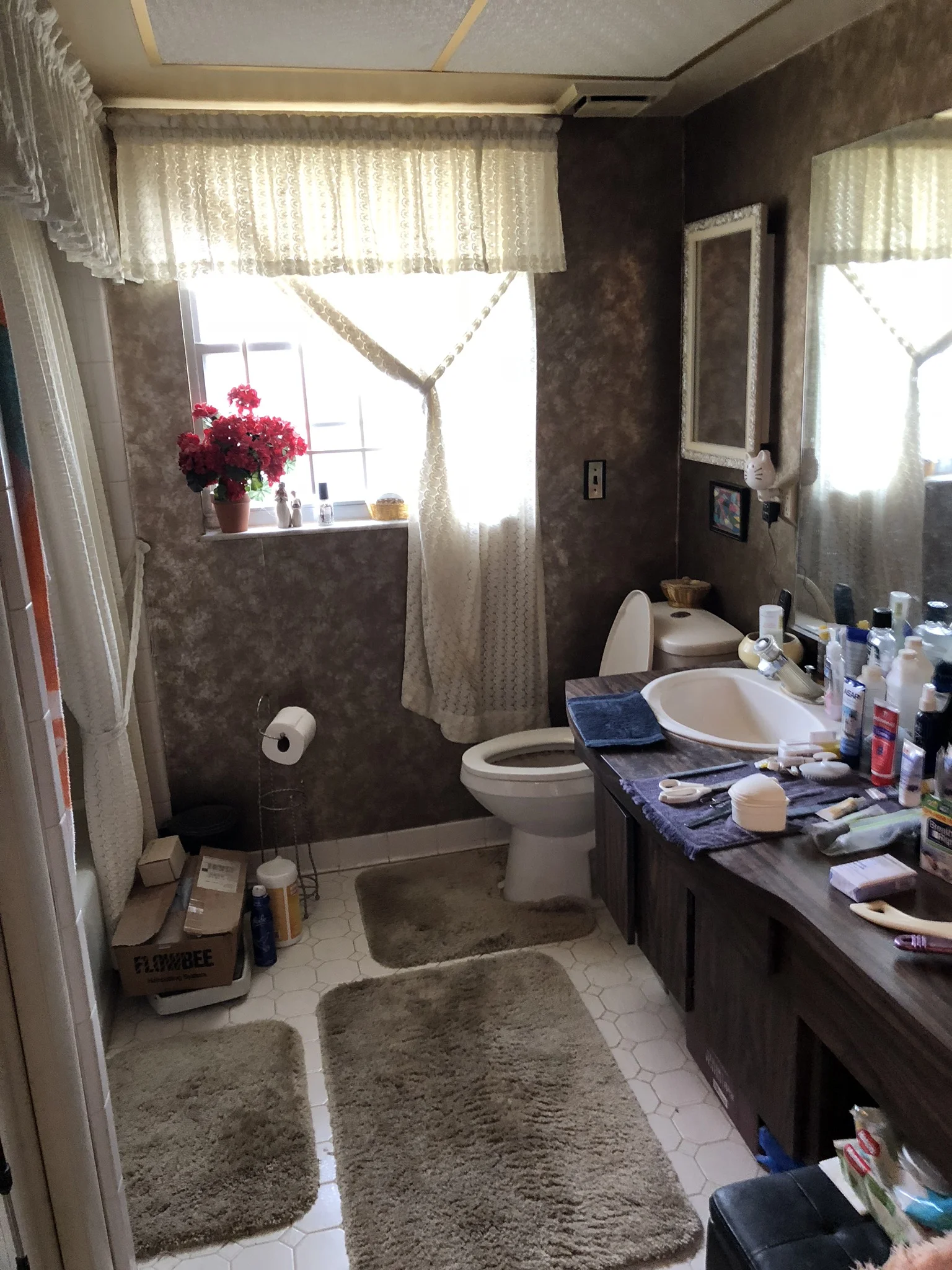
Believe it or not, this guest bathroom might have been the least offensive room in the house to begin with. This was how it looked on the day we first saw it..
I’m now kicking myself for not taking even more before pictures, but you get the gist. We had some fabulous metallic wallpaper, lots of heavy drapes/shower curtains, old metal closet doors, and a vanity covered in dark wood veneer. I considered keeping the floor tile in here for a hot second, but figured while we were already demoing 90% of the house I should just make the floor exactly what I wanted.
The Plan
Shop the design
Here’s the design plan for the guest bathroom so far. I’m going for a classic/mid century vibe while still keeping things feeling modern with stacked subway tile and sleek fixtures. The items on the design board have already been purchased, and are pretty definite. The art, lighting and accessories are still up in the air - I’ll figure those out a little further down the line.
I’m excited to get this room finished up over the next six weeks, and to see everyone else’s rooms come together too! Want to get in on the makeover action? You can join the One Room Challenge as a guest participant. Or if you just want to get some design inspiration, make sure you go check out all the other room transformations going on.
Touraine Project | Great Room Reveal
Hey strangers! My blogging game has been weak lately, but now that we’re (semi) settled into our new house, I really want to get back in a groove with it. What better way to ease in than finally revealing our previous house, aka The Touraine Project?! I’ve shared plenty of glimpses of it over on Instagram (are you following us yet?!) but wanted to dive a little deeper and share it here on the blog too. First up is the biggest - some may even say greatest - room in the house…the Great Room! Which is the catchall term I’m using for our open concept kitchen, living, and dining room area.
Hey strangers! My blogging game has been weak lately, but now that we’re (semi) settled into our new house, I really want to get back in a groove with it. What better way to ease in than finally revealing our previous house, aka The Touraine Project?! I’ve shared plenty of glimpses of it over on Instagram (are you following us yet?!) but wanted to dive a little deeper and share it here on the blog too. First up is the biggest - some may even say greatest - room in the house…the Great Room! Which is the catchall term I’m using for our open concept kitchen, living, and dining room area.
Let me take you all the way back to the year… 2016. When Ryan and I first walked into this (not so) great room, here’s the magic that greeted us:
That may or may not be a pee-soaked mattress on the left there… charming right?!
As you can see, you walked right into a wall, which I’m pretty sure is universally frowned upon. Ready for some afters?!
I’m currently sitting in that chair up there writing this blog post. I got two of them off of Craigslist for 60 bucks, and Ryan HATED them. I think they’ve grown on him a bit though… they’ve obviously made the move with us and are #heretostay! ;) You can also see a blurry peak into the dining room, so let’s jump over to that area. Here are a few of the scary before photos…
We had a lot of walls, a lot of brown, and a LOT of extremely dusty ceiling fans on our hands. Ready for the afters?
I could not love this space more and am obsessed with how the photographs turned out, thanks to Sarah’s mad skills! I chose to mix a more farmhouse style dining room table with modern copper chairs for contrast. It’s one of my favorite things to do with design - it just adds so much interest! I added sheep skins to the chairs for texture and comfort. Although we sold both the table and chairs to the new homeowners, the sheep skins made the move with us, and are looking mighty fine draped over our new dining chairs.
Painting the brick on the fireplace and adding a distressed wood mantel really lightened things up in here.. We added shiplap on the walls next to the fireplace and after living with those walls painted white for a bit, ended up painting them Benjamin Moore Cheating Heart. I’m so glad we did! It was looking (dare I say) TOO white in there, and there’s nothing I love more than balancing bright and airy with moody! The dark walls accomplish that and ground the space.
And the room everyone really wants to see… the kitchen!
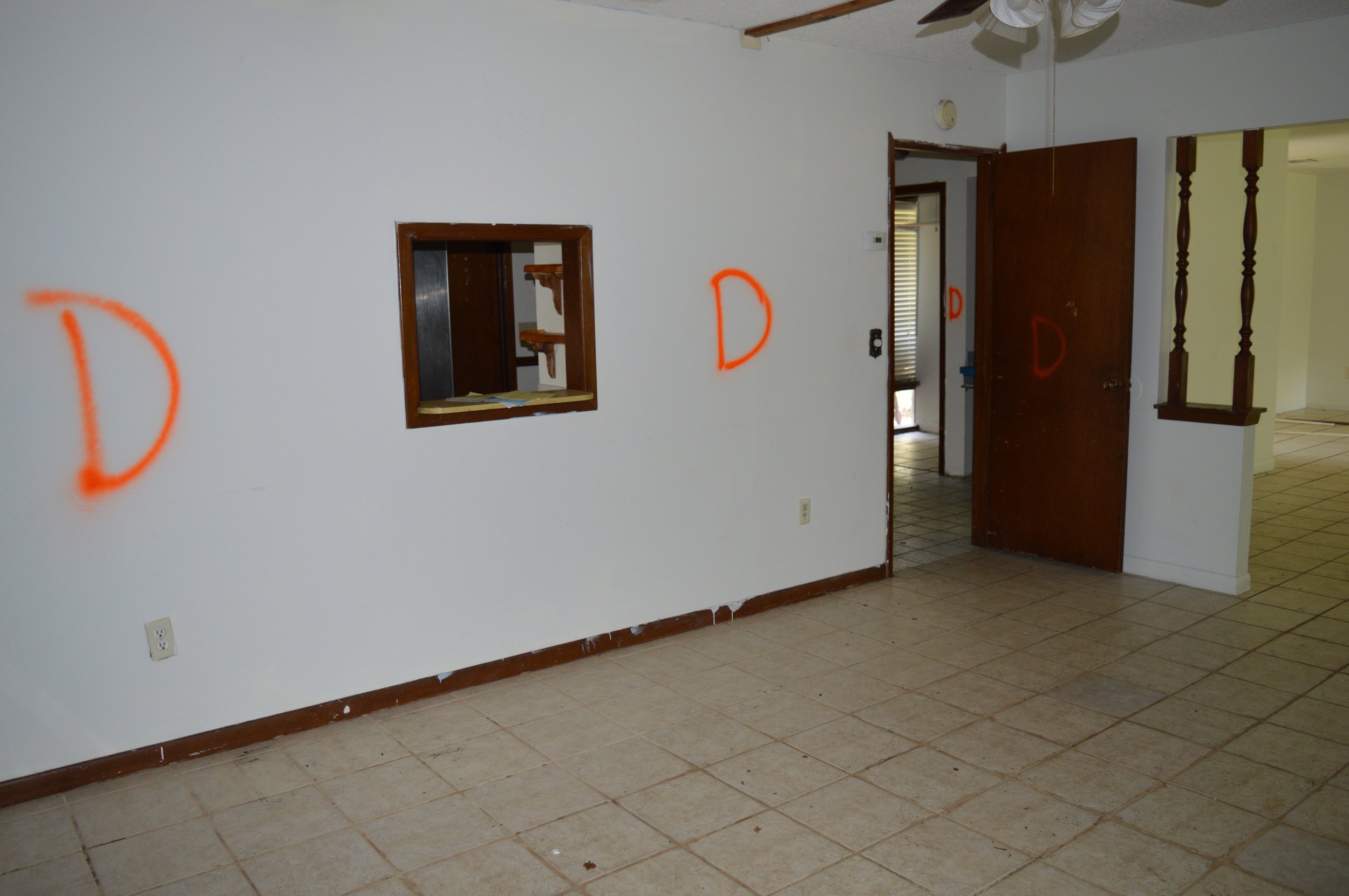
There was a huge wall dividing the kitchen from the dining area, making the kitchen into a tight, galley-style layout. The cabinets were falling apart and everything was dirty as all get out. After a few minor changes (ha!) here are the afters:
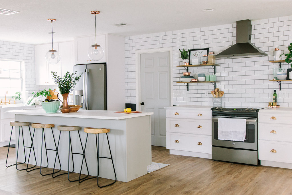
So much better without all those walls! We gained so much space in the kitchen, and got to add an 8 foot island that made me feel like I was on a cooking show when I stood behind it. My darling husband tiled that whole backsplash (and may or may not have wanted to kill me for making it go all the way to the ceiling…), installed the open shelving, and added the cabinet hardware. Talk about pressure - there’s really no room for error when you’re drilling into your brand new tile/cabinets.
When I look at the before photos of the kitchen remodel, I can hardly believe it’s the same space. It took a lot of blood, sweat, and tears (and, let’s be honest - money) to take this space from the before to the after, but it was well worth it. There’s not much that’s more satisfying as a designer - taking a space that’s rundown and scary and turning into something beautiful and functional.
Stay tuned for more Touraine Project reveals! And if you have your own Orlando renovation project to tackle, don’t hesitate to reach out - I’d love to help you design the space of your dreams!
Pssst - if you’re interested in sources for anything, you can now shop our house! I am slowly but surely getting everything possible up there - if it’s not on there, it’s probably from Craigslist or Homegoods! ;)


